
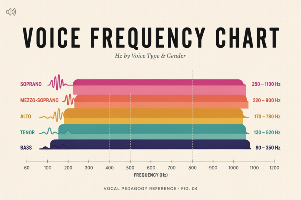
A voice frequency chart shows the typical fundamental frequency ranges associated with speaking voices, singing classifications, and musical notes. Fundamental frequency, often written as F0, is measured in hertz and describes how many times the vocal folds vibrate each second during a voiced sound.
Adult speaking voices commonly fall around 85–180 Hz for males and 165–255 Hz for females, while singing ranges extend much wider. These values overlap, so a chart should be used as a reference rather than a strict test of gender, age, or voice type.
What Is a Voice Frequency Chart?
A voice frequency chart connects vocal pitch with numerical frequency values in hertz. Lower frequencies sound deeper, while higher frequencies sound higher.
The chart usually refers to fundamental frequency rather than the complete sound spectrum. A person speaking at 120 Hz still produces harmonics and resonance energy above 120 Hz. The guide to fundamental frequency in the voice explains that distinction in more detail.
Speaking-frequency charts and singing-range charts answer different questions. Speaking charts describe habitual conversational pitch, while singing charts show the approximate lowest and highest notes associated with vocal classifications.
Master Voice Frequency Chart
The following table combines common speaking and singing references.
| Voice category | Typical note or use | Approximate frequency range |
|---|---|---|
| Adult male speech | Conversational voice | 85–180 Hz |
| Adult female speech | Conversational voice | 165–255 Hz |
| Children’s speech | Varies by age | About 250–400 Hz |
| Bass | E2–E4 | 82–330 Hz |
| Baritone | A2–A4 | 110–440 Hz |
| Tenor | C3–C5 | 131–523 Hz |
| Contralto | F3–F5 | 175–698 Hz |
| Mezzo-soprano | A3–A5 | 220–880 Hz |
| Soprano | C4–C6 | 262–1,047 Hz |
These figures are approximate. Different vocal systems may use slightly different boundaries.
For a broader explanation of these boundaries, see the human voice frequency range.
Average Speaking Voice Frequency Chart
Speaking frequency describes the pitch range used during ordinary conversation. It is not the same as maximum vocal range.
| Group | Common average range |
| Adult males | 85–180 Hz |
| Adult females | 165–255 Hz |
| Children | About 250–400 Hz |
| Older children and adolescents | Highly variable during development |
Adult Male Speaking Frequency
Adult male speech often falls between roughly 85 and 180 Hz. A voice near the lower end may be perceived as deep, while a voice near the upper end may sound lighter.
There is substantial natural overlap. Anatomy, age, language, emotional state, and speaking style all influence the result. The article on average male voice frequency provides more context.
Adult Female Speaking Frequency
Adult female speech commonly falls between about 165 and 255 Hz. Some voices sit below or above this range without being abnormal.
Pitch also shifts with emphasis, fatigue, and emotion, so one average cannot describe the entire pattern.
Children’s Speaking Frequency
Children usually have higher fundamental frequencies because their vocal folds and vocal tracts are smaller. Frequency generally decreases as the larynx and vocal folds develop.
Puberty can cause major changes as the vocal folds grow.
The comparison of male and female voice frequency explains why population averages should not be treated as fixed personal limits.
Singing Voice Frequency Chart by Voice Type
Singing classifications are based on more than the lowest and highest note. Tessitura, the area where the singer is most comfortable, matters alongside timbre, vocal weight, passaggi, and repertoire.
| Voice type | Common note range | Approximate frequency range |
| Bass | E2–E4 | 82–330 Hz |
| Baritone | A2–A4 | 110–440 Hz |
| Tenor | C3–C5 | 131–523 Hz |
| Contralto | F3–F5 | 175–698 Hz |
| Mezzo-soprano | A3–A5 | 220–880 Hz |
| Soprano | C4–C6 | 262–1,047 Hz |
Bass, Baritone, and Tenor
Bass is the lowest common singing classification, often summarized as E2–E4. Baritone sits above bass at approximately A2–A4, while tenor commonly spans C3–C5.
These ranges overlap. A baritone and tenor may share notes but differ in tessitura, transition points, and tone.
Contralto, Mezzo-Soprano, and Soprano
Contralto is commonly placed around F3–F5, mezzo-soprano around A3–A5, and soprano around C4–C6.
A mezzo-soprano may reach soprano notes, and a soprano may sing below C4. Classification depends on where the voice functions best.
The site’s overview of voice frequency in singers explains why maximum range and voice type are not identical.
Piano Note Frequency Chart
Musical-note frequencies follow a predictable octave pattern under A4 = 440 Hz tuning.
| Note | Approximate frequency |
| C2 | 65.4 Hz |
| A2 | 110 Hz |
| C3 | 130.8 Hz |
| A3 | 220 Hz |
| C4 | 261.6 Hz |
| A4 | 440 Hz |
| C5 | 523.3 Hz |
| A5 | 880 Hz |
| C6 | 1,046.5 Hz |
| C7 | 2,093 Hz |
Frequency doubles with each octave. A3 is 220 Hz, A4 is 440 Hz, and A5 is 880 Hz. The note name remains A, but the octave number and frequency change.
How to Read a Voice Frequency Chart
Start by identifying whether you are measuring speaking voice, singing voice, or one sustained note. Comparing the wrong type of measurement can lead to misleading conclusions.
Find Your Average Speaking Frequency
Record 30 to 60 seconds of natural speech rather than one long vowel. Use a quiet room and keep the microphone at a consistent distance.
A pitch-tracking tool may show an average F0 and a broader pitch range. Compare the average with the speaking chart while remembering that language and emotion can alter the result.
Compare Comfortable Singing Notes
For singing, warm up gently and find the lowest and highest notes you can sustain without strain. Then identify the narrower area where tone and control remain stable.
That comfortable area is more useful for voice classification than a single extreme high or low note.
Do Not Judge Voice Type by One Number
A 110 Hz note could appear in bass, baritone, tenor, or even another voice with a low extension. Frequency identifies the pitch, not the singer’s complete vocal category.
The distinction between voice frequency and pitch helps prevent this common mistake.
Why Do Voice Frequency Ranges Overlap?
Voice ranges overlap because human anatomy varies continuously rather than falling into perfectly separated categories.
Training can also extend usable range, improve register transitions, and change how consistently a singer produces certain notes. Two people with the same endpoints may have different tessituras and timbres.
Background noise, echo, microphone processing, vocal fry, and unstable phonation can also cause errors.
How to Measure Your Voice Frequency
Use a quiet room, natural volume, and consistent microphone distance. Record both a normal speech sample and sustained singing notes if you want a complete picture.
Repeat each test several times. A result that appears consistently is more useful than a frequency detected only once.
The guide to checking voice frequency provides a practical procedure, while the explanation of how voice frequency is measured covers the technical side.
Online and phone-based results are estimates, not clinical acoustic analysis.
Common Mistakes When Using Voice Charts
A frequent mistake is confusing speaking pitch with singing range. Someone may speak near 120 Hz yet sing across several octaves.
Another mistake is confusing frequency with resonance. Fundamental frequency identifies the pitch, while resonance and harmonics shape tone quality.
It is also misleading to use one strained low or high note as proof of voice type. Comfortable, repeatable notes matter more than isolated extremes.
Frequently Asked Questions
What is a normal voice frequency?
Adult male speech commonly falls around 85–180 Hz, while adult female speech often falls around 165–255 Hz. Healthy voices can sit outside these averages.
How do I use a voice frequency chart?
Identify whether you are measuring speech, singing range, or one note. Then compare a repeated, comfortable result with the appropriate section of the chart.
What frequency is considered a deep voice?
A speaking voice near the lower end of the adult range may be perceived as deep. There is no single universal cutoff because perception also depends on resonance and vocal tract size.
Can a voice frequency chart identify my voice type?
Not by itself. Voice type also depends on tessitura, timbre, vocal weight, register transitions, and repertoire.
Why does my measured frequency change?
Pitch changes naturally with emotion, emphasis, fatigue, illness, volume, and speaking task. Microphone and room conditions can also affect the reading.
Are online voice frequency charts accurate?
They are useful reference tools when based on standard note frequencies and accepted average ranges. Individual results should still be treated as estimates rather than diagnoses.

Bobby is a voice analysis and vocal testing writer at VoiceFrequencyTest. He focuses on vocal frequency analysis, pitch recognition, voice measurement tools, and singing education for vocalists, musicians, creators, and beginners.